
In our work with visual content and digital strategy for B2B companies, we often cross paths with the automotive retail space. The more we observe how dealerships approach their car dealership marketing — from ads to websites to landing pages — the more we notice a pattern: even well-established, reputable businesses regularly make avoidable mistakes in how they present themselves online.
And it’s not about things being “poorly done.” Most of the time, these are subtle details that go unnoticed — but they shape the first impression, build (or break) trust, and influence what the customer does next.
Sometimes a strong dealership ends up looking like a side project — simply because the site hasn’t been updated since 2015. Or because the banners were made last-minute. Or because in the flow of daily operations, there just wasn’t time to think through the visual strategy.
We’re not here to criticize — we get it. Inside every dealership, priorities are stacked: inventory, staffing, logistics, financing. And digital often becomes something like “we’ll fix it when we can.”
But here’s the reality: your online presence isn’t decoration. It’s your digital showroom. Your virtual salesperson. And in many cases — your only shot at keeping someone from clicking away to a competitor.
So we’ve put together the 5 most common mistakes we see in digital advertising for car dealerships. Along with clear, simple ideas for how to fix them. No big rebrands. No full rebuilds. Just sharper thinking — and more attention to the right details.
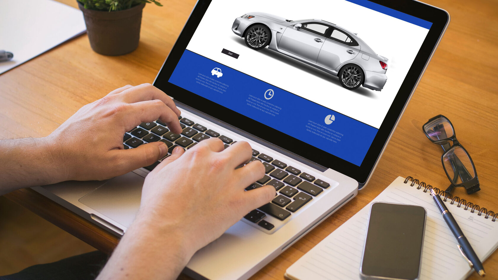
1. OUTDATED OR OVERLOADED WEBSITE
This is by far the most common issue we encounter when working with car dealers. And no — it’s usually not due to neglect or resistance to change. Most of the time, it’s simply a matter of priorities: “We built it a while back, it still works,” or “We sell cars, not websites.” We hear this a lot.
But the truth is — especially in the auto industry — your website isn’t just a business card. It’s the first touchpoint, and very often, the only one. If a customer lands there from an ad or a search, they’ll decide in 5–10 seconds whether to stay — or leave and look elsewhere.
🔴 Here are the issues we see most often in car dealer website design:
And these sites don’t push people away because they’re “badly made.” They do it because they feel outdated — and that feeling spills over into how the customer views everything else: service, inventory, even credibility.
You don’t get a second chance at trust. If your “Schedule a Test Drive” button is off-center, or your inventory menu won’t load on iPhone — people won’t report a bug. They’ll just close the tab.
This isn’t about taste. It’s about perception.
Your website sets the tone for everything else. If it doesn’t speak clearly — customers assume your business doesn’t either.
But the truth is — especially in the auto industry — your website isn’t just a business card. It’s the first touchpoint, and very often, the only one. If a customer lands there from an ad or a search, they’ll decide in 5–10 seconds whether to stay — or leave and look elsewhere.
🔴 Here are the issues we see most often in car dealer website design:
- Sites still stuck in the early-2010s: heavy drop shadows, outdated layouts, harsh color schemes, awkward fonts.
- Text overload: long “About Us” sections, vague dealership bios, but no clear offers or actions the visitor can take.
- Poor mobile experience — which is a dealbreaker, since up to 70% of traffic for many auto dealership websites now comes from smartphones.
And these sites don’t push people away because they’re “badly made.” They do it because they feel outdated — and that feeling spills over into how the customer views everything else: service, inventory, even credibility.
You don’t get a second chance at trust. If your “Schedule a Test Drive” button is off-center, or your inventory menu won’t load on iPhone — people won’t report a bug. They’ll just close the tab.
This isn’t about taste. It’s about perception.
Your website sets the tone for everything else. If it doesn’t speak clearly — customers assume your business doesn’t either.

2. «WE’RE A DEALERSHIP» ISN’T AN OFFER
This one’s not a mistake as much as a missed opportunity — but it's a big one. In modern digital marketing for auto dealerships, people are used to clarity. Every ad, every landing page, every Instagram post is expected to say something specific. Simple. Concrete.
But what do we still often see in dealership ads?
That might have worked 10 years ago. Today, it fades into the background. Users scroll past it without stopping — not because it's wrong, but because it's too general.
Too vague = invisible.
The issue isn’t that there’s no value proposition. The issue is that it’s not being communicated clearly. Which, to the user, is the same as it not being there at all.
👉 Common “empty” phrases in car dealer advertising:
These don’t answer the only question that matters:
What do I get — and why should I care right now?
This is where specificity wins. Even small, real-world statements work better:
Even something like “VIN visible online” or “Video walkaround included” instantly makes the dealership feel more transparent, more real.
These may seem like small details — but in car dealership marketing, small details are what separate a trustworthy business from just another listing site.
But what do we still often see in dealership ads?
- A logo.
- “Authorized dealer for X and Y.”
- “Large vehicle selection.”
- And maybe a small “Learn more” button.
That might have worked 10 years ago. Today, it fades into the background. Users scroll past it without stopping — not because it's wrong, but because it's too general.
Too vague = invisible.
The issue isn’t that there’s no value proposition. The issue is that it’s not being communicated clearly. Which, to the user, is the same as it not being there at all.
👉 Common “empty” phrases in car dealer advertising:
- “Huge inventory”
- “Great deals”
- “Professional staff”
- “Serving customers for 15 years”
These don’t answer the only question that matters:
What do I get — and why should I care right now?
This is where specificity wins. Even small, real-world statements work better:
- 🚗 “3 vehicles in stock — no wait”
- 💰 “Trade-in completed in one visit”
- 🔧 “First oil change free”
- 📦 “Actual photos — no catalog images”
Even something like “VIN visible online” or “Video walkaround included” instantly makes the dealership feel more transparent, more real.
These may seem like small details — but in car dealership marketing, small details are what separate a trustworthy business from just another listing site.
3. INCONSISTENT VISUALS = INSTANT DISTRUST
If we had to sum it up in one sentence: visuals build trust.
Not originality. Not attention-grabbing tricks. Just one simple question: can I trust this business?
Especially in the automotive space, people are used to a certain standard. Even if you’re a small, independent dealer — customers still expect clean, consistent visual branding:
But in reality, we often see:
Not originality. Not attention-grabbing tricks. Just one simple question: can I trust this business?
Especially in the automotive space, people are used to a certain standard. Even if you’re a small, independent dealer — customers still expect clean, consistent visual branding:
- No chaos
- No clashing fonts or colors
- No “PowerPoint collage” energy
But in reality, we often see:
- Banners in different styles: one day bright blue, the next day neon red
- Photos with mismatched lighting, different weather, no unified angle
- Overlays, stickers, arrows, cut-off text — sometimes three fonts in one post

And when customers are tired or confused — they scroll past. Fast.
This is especially critical in a high-consideration space like auto sales, where people aren’t just looking for information — they’re looking for a reason to believe.
👉 Here’s what’s important:
Customers don’t evaluate visual elements one by one. They take in the whole feel. And if everything looks intentional, the brain says:
“Okay — these people know what they’re doing.”
But if your ad looks sloppy? That impression sticks.
“If their marketing is messy… how organized is the rest of the experience?”
Great visuals in car dealer advertising aren’t about being flashy.
They’re about structure. About visual logic. About a sense of care.
Ideally, your assets include:
📌 And yes — a well-made template beats “let’s wing it” every time.
Because a template is a system. And systems feel safe.
This is especially critical in a high-consideration space like auto sales, where people aren’t just looking for information — they’re looking for a reason to believe.
👉 Here’s what’s important:
Customers don’t evaluate visual elements one by one. They take in the whole feel. And if everything looks intentional, the brain says:
“Okay — these people know what they’re doing.”
But if your ad looks sloppy? That impression sticks.
“If their marketing is messy… how organized is the rest of the experience?”
Great visuals in car dealer advertising aren’t about being flashy.
They’re about structure. About visual logic. About a sense of care.
Ideally, your assets include:
- A single visual style across platforms
- Clear, simple typography
- Real photos — of real vehicles, on your lot
- VIN numbers, model names, and even the people behind the sale
📌 And yes — a well-made template beats “let’s wing it” every time.
Because a template is a system. And systems feel safe.
4. A DISCONNECTED AD PATH BREAKS
THE JOURNEY
Everything starts well: the banner looks clean, the creative is solid, the click-through rate is promising... and then it falls apart:
🔹 The customer clicks — and lands on your homepage.
🔹 Or on a general inventory list that doesn’t include the promoted vehicle.
🔹 Or just on a generic “Vehicles” page — even though the ad promised a specific offer.
That’s the moment the user loses the thread. And when that happens, they lose interest.
In digital marketing, this disconnect is called message mismatch — the difference between what was promised and what the customer actually sees.
And here’s what matters: users won’t dig. They won’t investigate why the offer “disappeared.” They’ll just close the tab. Silently.
This doesn’t mean you need to build custom landing pages for every offer. Often, it's enough to:
📌 Good advertising isn’t just about catching attention. It’s about guiding it.
If someone clicked — that’s already trust in action.
The job now is to carry them forward — not drop them into a maze.
🔹 The customer clicks — and lands on your homepage.
🔹 Or on a general inventory list that doesn’t include the promoted vehicle.
🔹 Or just on a generic “Vehicles” page — even though the ad promised a specific offer.
That’s the moment the user loses the thread. And when that happens, they lose interest.
In digital marketing, this disconnect is called message mismatch — the difference between what was promised and what the customer actually sees.
And here’s what matters: users won’t dig. They won’t investigate why the offer “disappeared.” They’ll just close the tab. Silently.
This doesn’t mean you need to build custom landing pages for every offer. Often, it's enough to:
- Link directly to a filtered selection
- Highlight the exact model or category shown in the ad
- Use a banner to clearly restate the offer
- Or — if the specific car is no longer available — simply say so.
- Transparency always builds more trust than redirecting people into a general catalog.
📌 Good advertising isn’t just about catching attention. It’s about guiding it.
If someone clicked — that’s already trust in action.
The job now is to carry them forward — not drop them into a maze.
5. IGNORING VIDEO = MISSING
A MAJOR TRUST SIGNAL
Let’s keep it simple: if your dealership doesn’t use video, you’re far less likely to be taken seriously — even if everything else is done well.

Buyers are used to seeing real, live visuals of products. YouTube, Reels, Shorts, TikTok, stories — people expect to “see it in action” before they even consider reaching out.
And yet, here’s what we still often see:
📌 This isn’t about high-end production.
In fact, the opposite is often more effective.
A quick, honest, unpolished clip from your phone — walking around the car, showing the interior, opening the trunk — immediately sends the message:
“This is a real vehicle, in a real place, handled by real people.”
It’s also incredibly practical for customer communication.
Instead of “I’ll send some pictures,” you send a 30-second video — and instantly get a reaction:
✔️ “Looks great, I’m interested.”
✖️ “I was hoping for a light interior.”
You save time and create a much more personal connection.
More importantly, you show transparency.
Buying a car is not just a financial decision — it’s emotional. There are risks, doubts, hesitations. Video lowers anxiety — even if you don’t realize it.
Whether you’re showing the car, your service area, or just your sales rep’s hands — it all makes you feel more trustworthy.
And here’s the thing: if you’re not doing it, your competitors almost certainly are.
Even small, local dealerships are leaning into video marketing for car dealers — not because they have fancy gear, but because they speak the customer’s language. And right now, that language is visual, mobile, and human.
And yet, here’s what we still often see:
- Static photo listings — sometimes even using stock images or manufacturer photos
- Zero walkaround videos, even though the car is right there on the lot
- No Instagram stories or reels, even when your audience is active on the platform
📌 This isn’t about high-end production.
In fact, the opposite is often more effective.
A quick, honest, unpolished clip from your phone — walking around the car, showing the interior, opening the trunk — immediately sends the message:
“This is a real vehicle, in a real place, handled by real people.”
It’s also incredibly practical for customer communication.
Instead of “I’ll send some pictures,” you send a 30-second video — and instantly get a reaction:
✔️ “Looks great, I’m interested.”
✖️ “I was hoping for a light interior.”
You save time and create a much more personal connection.
More importantly, you show transparency.
Buying a car is not just a financial decision — it’s emotional. There are risks, doubts, hesitations. Video lowers anxiety — even if you don’t realize it.
Whether you’re showing the car, your service area, or just your sales rep’s hands — it all makes you feel more trustworthy.
And here’s the thing: if you’re not doing it, your competitors almost certainly are.
Even small, local dealerships are leaning into video marketing for car dealers — not because they have fancy gear, but because they speak the customer’s language. And right now, that language is visual, mobile, and human.

Conclusion
We don’t believe in one-size-fits-all solutions.
Digital strategy for car dealerships is always a mix of real-world business, internal processes, team bandwidth, and local specifics. But despite all the differences, the same mistakes show up again and again.
This article isn’t about pointing fingers.
It’s simply based on what we’ve observed.
We work closely with the visual side of automotive marketing, and we see how often it gets pushed aside — saved for “later,” “after the launch,” or “when there’s time.”
But the truth is: your visual presence is one of the most accessible levers you have to:
A strong digital presentation for a car dealer doesn’t require massive budgets or flashy campaigns.
It just needs to clearly answer three things:
Where am I? What are you offering me? And can I trust you to deliver?
We don’t believe in one-size-fits-all solutions.
Digital strategy for car dealerships is always a mix of real-world business, internal processes, team bandwidth, and local specifics. But despite all the differences, the same mistakes show up again and again.
This article isn’t about pointing fingers.
It’s simply based on what we’ve observed.
We work closely with the visual side of automotive marketing, and we see how often it gets pushed aside — saved for “later,” “after the launch,” or “when there’s time.”
But the truth is: your visual presence is one of the most accessible levers you have to:
- Build trust
- Save your team time
- And turn a cold first click into a warm first conversation
A strong digital presentation for a car dealer doesn’t require massive budgets or flashy campaigns.
It just needs to clearly answer three things:
Where am I? What are you offering me? And can I trust you to deliver?

If you saw your dealership in even one of these five points — that’s already a great reason to review your approach.
And if you ever need an outside perspective, honest feedback, a smart redesign — or just a practical conversation — reach out.
At TXSized.pro, we don’t create for the sake of creativity.
And if you ever need an outside perspective, honest feedback, a smart redesign — or just a practical conversation — reach out.
At TXSized.pro, we don’t create for the sake of creativity.