Between Bland and Glossy: Where’s the Line for Effective Visual Content?
When it comes to ad creatives, many people tend to see visual style as a matter of personal preference. Some gravitate toward authentic content — real photos, behind-the-scenes images, unfiltered moments. Others prefer polished commercial visuals with bold colors, clean layouts, or even 3D renders. As a result, conversations about creative direction often end with subjective opinions like “I just like it better this way.” But in real-world marketing, visual decisions can’t be driven by taste alone. The visual style in advertising isn’t decoration — it’s a tool. And that tool needs to serve a purpose.
The role of visual content is not simply to look good. Its job is to capture attention, communicate a value proposition in seconds, create trust, and drive action. Whether that action is a click, a lead, or a purchase, the visual must be aligned with business goals. This is why relying on taste or instinct often leads to inconsistent results. One visual style might perform brilliantly on Instagram but fail completely on a B2B landing page. In performance marketing, ad creative that converts is always rooted in context and strategy.
The role of visual content is not simply to look good. Its job is to capture attention, communicate a value proposition in seconds, create trust, and drive action. Whether that action is a click, a lead, or a purchase, the visual must be aligned with business goals. This is why relying on taste or instinct often leads to inconsistent results. One visual style might perform brilliantly on Instagram but fail completely on a B2B landing page. In performance marketing, ad creative that converts is always rooted in context and strategy.
Take, for example, the idea of using staff photos in a local dealership campaign. Real faces can foster transparency and a sense of connection. But if the photo is poorly lit, visually bland, or low resolution, it can actually weaken the message. On the other hand, a hyper-stylized banner filled with bright gradients and stock elements might grab attention quickly, but feel artificial or untrustworthy — especially for B2B audiences looking for credibility.

Authenticity builds trust — when the scene feels real, not staged
The biggest mistake brands make is choosing visuals simply because “they look good.” Instead, smart marketers start with the audience, the message, and the placement. A well-performing ad creative is not necessarily the prettiest one — it’s the one that feels natural in its environment and emphasizes what really matters. The best marketing visuals don’t overpower the offer — they support it.
At Texas-Sized Promo, we treat every visual direction as a strategic choice. We help clients find the right balance between authentic content and commercial design — not too raw, not too glossy. We carefully assess how much visual intensity is appropriate, how “real” a photo should look, and how colors, typography, layout, and motion contribute to clarity and trust. Because in advertising, creative style is not just about aesthetics — it's about results.
In advertising, authentic visual content typically refers to imagery based on real photography rather than stylized or heavily processed graphics. This includes actual team photos, behind-the-scenes shots, real business locations, and everyday work environments. It’s often positioned as the opposite of polished commercial visuals that rely on bold colors, staged lighting, 3D renders, or heavy post-production.
The growing demand for real photography in advertising is largely rooted in its ability to foster trust. Audiences tend to respond more positively to visuals that feel relatable and grounded in reality. If a person sees an actual employee of a dealership instead of a stock model, the message comes across as more honest. A photo shot in a real workspace — rather than against a generic background — signals presence and local relevance. This approach is especially effective in B2B marketing or regional campaigns, where trust in the service provider plays a critical role in decision-making.
Real content also gives a sense of specificity. It helps reduce the emotional distance between the brand and the customer. This can be particularly important for businesses with physical locations such as dealerships, showrooms, restaurants, or repair shops. Human-centered brand imagery shows that there are real people behind the service — people you can talk to, visit, and trust. That’s why so many companies showcase team photos, customer interactions, and their actual working spaces on social media and landing pages.
However, authentic visuals don’t automatically translate into effective visuals. Without attention to composition, lighting, or clarity, even a real and honest photo can end up looking dull or unprofessional. Instead of reinforcing the brand’s value, it may weaken it by creating a sense of visual clutter or low effort. Behind-the-scenes visuals only work when paired with smart design choices — such as readable typography, intentional use of space, and visual hierarchy. Otherwise, they risk becoming background noise in a crowded digital feed.
Strong authentic content doesn’t mean "raw." It means thoughtful. The best real-life visuals preserve authenticity but follow essential visual principles — clarity, contrast, focus, and emotional relevance. When that balance is achieved, the content does more than just look real. It builds trust, conveys professionalism, and makes the brand feel human — without the artificial gloss or excessive polish that often turns viewers away.
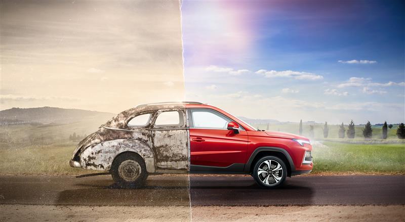
The glossy visual style in advertising is often associated with high production quality, strong visual appeal, and a “showcase” effect. It features bold colors, clean compositions, focused visual hierarchy, professional typography, and often enhanced techniques like 3D elements, gradients, or animation. This design approach is meant to immediately grab attention and deliver the key message with clarity and intensity. That’s why it’s widely used in digital banners, email campaigns, landing pages, and high-impact promotional materials.
One of the biggest advantages of polished ad creatives is their ability to work well in fast-paced environments. They’re designed for screen viewing, optimized for scanning, and structured to highlight one central message. This makes them especially effective in formats like social media ads or paid placements, where users scroll quickly and make split-second decisions about what’s worth their attention. A well-crafted, high-contrast banner often wins those critical first two seconds.
At Texas-Sized Promo, we treat every visual direction as a strategic choice. We help clients find the right balance between authentic content and commercial design — not too raw, not too glossy. We carefully assess how much visual intensity is appropriate, how “real” a photo should look, and how colors, typography, layout, and motion contribute to clarity and trust. Because in advertising, creative style is not just about aesthetics — it's about results.
In advertising, authentic visual content typically refers to imagery based on real photography rather than stylized or heavily processed graphics. This includes actual team photos, behind-the-scenes shots, real business locations, and everyday work environments. It’s often positioned as the opposite of polished commercial visuals that rely on bold colors, staged lighting, 3D renders, or heavy post-production.
The growing demand for real photography in advertising is largely rooted in its ability to foster trust. Audiences tend to respond more positively to visuals that feel relatable and grounded in reality. If a person sees an actual employee of a dealership instead of a stock model, the message comes across as more honest. A photo shot in a real workspace — rather than against a generic background — signals presence and local relevance. This approach is especially effective in B2B marketing or regional campaigns, where trust in the service provider plays a critical role in decision-making.
Real content also gives a sense of specificity. It helps reduce the emotional distance between the brand and the customer. This can be particularly important for businesses with physical locations such as dealerships, showrooms, restaurants, or repair shops. Human-centered brand imagery shows that there are real people behind the service — people you can talk to, visit, and trust. That’s why so many companies showcase team photos, customer interactions, and their actual working spaces on social media and landing pages.
However, authentic visuals don’t automatically translate into effective visuals. Without attention to composition, lighting, or clarity, even a real and honest photo can end up looking dull or unprofessional. Instead of reinforcing the brand’s value, it may weaken it by creating a sense of visual clutter or low effort. Behind-the-scenes visuals only work when paired with smart design choices — such as readable typography, intentional use of space, and visual hierarchy. Otherwise, they risk becoming background noise in a crowded digital feed.
Strong authentic content doesn’t mean "raw." It means thoughtful. The best real-life visuals preserve authenticity but follow essential visual principles — clarity, contrast, focus, and emotional relevance. When that balance is achieved, the content does more than just look real. It builds trust, conveys professionalism, and makes the brand feel human — without the artificial gloss or excessive polish that often turns viewers away.
The glossy visual style in advertising is often associated with high production quality, strong visual appeal, and a “showcase” effect. It features bold colors, clean compositions, focused visual hierarchy, professional typography, and often enhanced techniques like 3D elements, gradients, or animation. This design approach is meant to immediately grab attention and deliver the key message with clarity and intensity. That’s why it’s widely used in digital banners, email campaigns, landing pages, and high-impact promotional materials.
One of the biggest advantages of polished ad creatives is their ability to work well in fast-paced environments. They’re designed for screen viewing, optimized for scanning, and structured to highlight one central message. This makes them especially effective in formats like social media ads or paid placements, where users scroll quickly and make split-second decisions about what’s worth their attention. A well-crafted, high-contrast banner often wins those critical first two seconds.

Polished visuals can elevate perception — especially when clarity and structure matter
Another benefit is scalability. Glossy-style designs can be easily adapted across multiple formats — from display ads to print assets to in-store visuals — which is crucial for brands managing broad omnichannel campaigns. A strong visual system built on commercial design principles offers consistency, recognizability, and efficient rollout.
However, glossy visuals have their downsides. If taken too far, they can feel artificial or detached from reality. This happens when designs prioritize style over substance — overly saturated images, overly perfect people, stock-style poses, or excessive graphic effects. Instead of building trust, these visuals may trigger skepticism, especially in B2B marketing, where authenticity and credibility often matter more than flashiness.
There’s also a risk of low-budget gloss. If execution isn’t precise — if colors are off, typography is noisy, or visual balance is lacking — the end result can come across as cheap or outdated, even if the intent was high-end. In this sense, glossy ad design is demanding: it requires technical expertise, a sharp eye, and tight creative control.
A high-converting promo design in glossy style only works when aligned with the brand’s tone, purpose, and context. When the style enhances the message — not distracts from it — it becomes a valuable part of the communication. But when it’s used just for decoration or trends, it can quickly become visual noise users scroll past without a second thought.
At Texas-Sized Promo, we use glossy elements when they serve a purpose — for example, in seasonal campaigns, offer-driven promotions, or email visuals with a short time-to-conversion. But even then, we aim to keep the design light, balanced, and message-focused. Our goal is not just to be “visually loud,” but to create graphic ad designs that sell without shouting, and visuals that leave a clear, confident impression without sacrificing trust.
While it’s easy to debate the benefits of real-life content versus polished commercial visuals, the truth is that context decides what actually works. In a real-world agency setting, the most important factor isn’t choosing a visual “side,” but understanding which creative direction supports the objective, fits the placement channel, and resonates with the intended audience.
At Texas-Sized Promo, we’ve found that the most effective advertising visuals often blend both approaches — combining the authenticity of real photography with the structure and clarity of polished design. If you rely purely on raw, unedited imagery, the result may look too plain or unprofessional, especially in digital feeds where attention spans are short. On the other hand, overproduced or overly stylized banners can come across as artificial, causing the viewer to lose trust. This is why we frequently build hybrid ad visuals — authentic at the core, but enhanced for clarity, brand alignment, and emotional response.
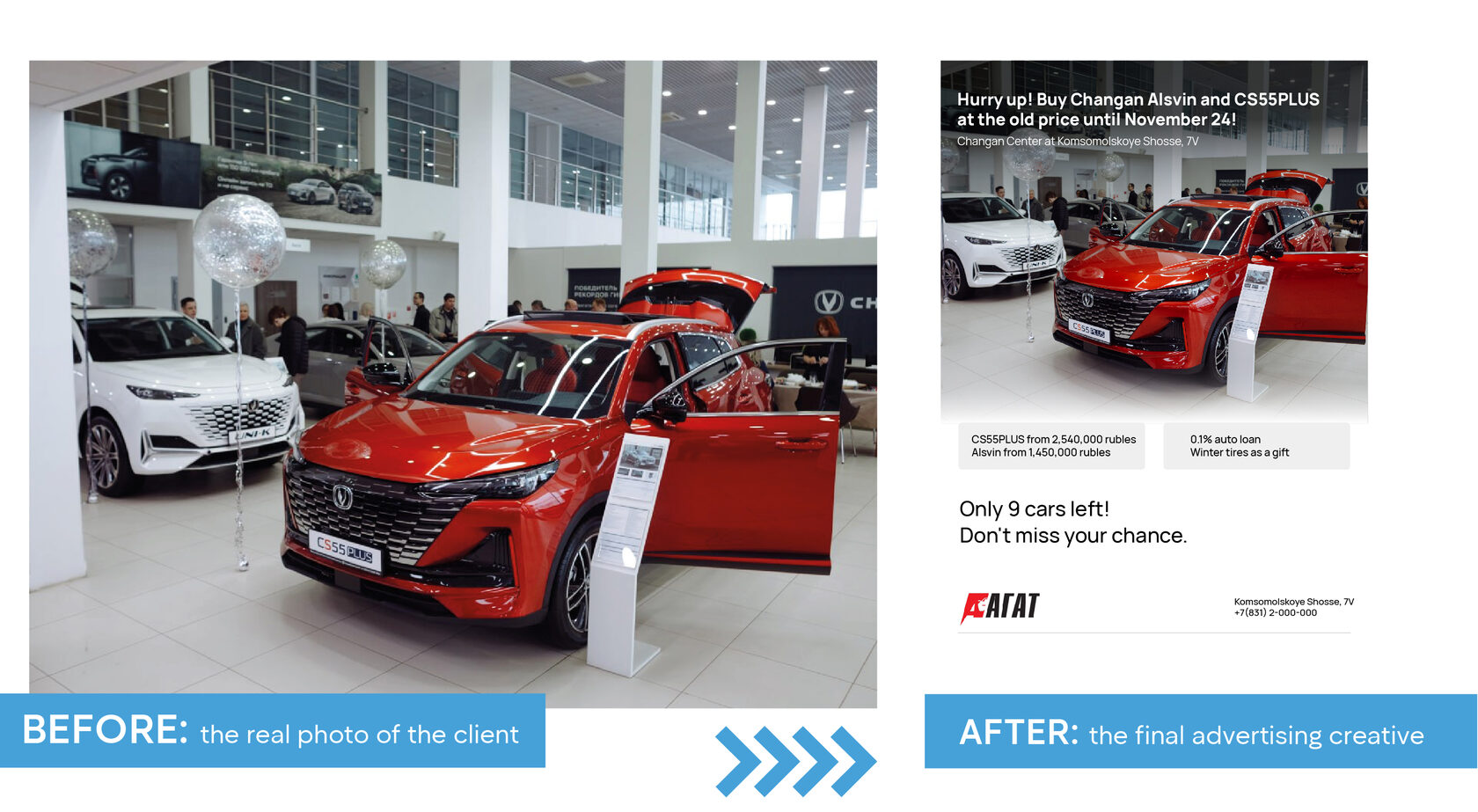
One example: auto dealership creatives. We’ve run campaigns that used actual team or showroom photos as a base, then added subtle color correction, clean backgrounds, strategic typography, and a clear layout. This kind of content preserves the human connection of real photos in advertising while delivering the professionalism expected in paid media. It's especially effective in local marketing, where audiences care about familiarity and presence — but still expect visual polish.
However, glossy visuals have their downsides. If taken too far, they can feel artificial or detached from reality. This happens when designs prioritize style over substance — overly saturated images, overly perfect people, stock-style poses, or excessive graphic effects. Instead of building trust, these visuals may trigger skepticism, especially in B2B marketing, where authenticity and credibility often matter more than flashiness.
There’s also a risk of low-budget gloss. If execution isn’t precise — if colors are off, typography is noisy, or visual balance is lacking — the end result can come across as cheap or outdated, even if the intent was high-end. In this sense, glossy ad design is demanding: it requires technical expertise, a sharp eye, and tight creative control.
A high-converting promo design in glossy style only works when aligned with the brand’s tone, purpose, and context. When the style enhances the message — not distracts from it — it becomes a valuable part of the communication. But when it’s used just for decoration or trends, it can quickly become visual noise users scroll past without a second thought.
At Texas-Sized Promo, we use glossy elements when they serve a purpose — for example, in seasonal campaigns, offer-driven promotions, or email visuals with a short time-to-conversion. But even then, we aim to keep the design light, balanced, and message-focused. Our goal is not just to be “visually loud,” but to create graphic ad designs that sell without shouting, and visuals that leave a clear, confident impression without sacrificing trust.
While it’s easy to debate the benefits of real-life content versus polished commercial visuals, the truth is that context decides what actually works. In a real-world agency setting, the most important factor isn’t choosing a visual “side,” but understanding which creative direction supports the objective, fits the placement channel, and resonates with the intended audience.
At Texas-Sized Promo, we’ve found that the most effective advertising visuals often blend both approaches — combining the authenticity of real photography with the structure and clarity of polished design. If you rely purely on raw, unedited imagery, the result may look too plain or unprofessional, especially in digital feeds where attention spans are short. On the other hand, overproduced or overly stylized banners can come across as artificial, causing the viewer to lose trust. This is why we frequently build hybrid ad visuals — authentic at the core, but enhanced for clarity, brand alignment, and emotional response.
One example: auto dealership creatives. We’ve run campaigns that used actual team or showroom photos as a base, then added subtle color correction, clean backgrounds, strategic typography, and a clear layout. This kind of content preserves the human connection of real photos in advertising while delivering the professionalism expected in paid media. It's especially effective in local marketing, where audiences care about familiarity and presence — but still expect visual polish.
Real input, strategic output: the transformation of content into performance-driven design
Another proven format is using well-designed templates with customizable fields. For franchise networks or regional chains, this allows for consistent branding across dozens of locations while still accommodating individual offers, contact details, or service highlights. These modular ad creatives use the strength of commercial design as a framework, but bring in local relevance through tailored content.
We’ve also noticed that even in high-competition industries — such as auto service, construction, or healthcare — strong performance comes from simplicity and structure. Clean backgrounds, bold yet readable headlines, consistent font usage, and offer-first focus tend to outperform more “creative” but cluttered designs. Even when real imagery is used, it must be presented in a format that’s easy to digest and visually intentional. A random photo, no matter how genuine, doesn’t convert on its own.
What converts in advertising isn’t a matter of aesthetic taste — it’s a matter of matching message, audience, and context. In that sense, strong ad visuals are not about showing off design skills, but about creating designs that drive engagement and support business goals. And this is where agency expertise becomes most valuable — not in choosing between “real” and “refined,” but in knowing how to balance authenticity and polish for the right outcome.
There’s no universal formula for the perfect ad visual. But in our experience at Texas-Sized Promo, a set of visual design best practices consistently helps us find the right balance between real-life content and polished advertising graphics. These principles are not tied to trends or subjective tastes. They’re rooted in business goals, content consumption behavior, and the realities of how users interact with visuals across platforms.
1. Define the objective first.
We don’t start with colors or image filters. We start with questions. Where will this visual appear? Who will see it? What action are we asking them to take? For limited-time offers, we prioritize clarity, structure, and attention-grabbing contrast. For brand awareness or trust-building campaigns, authentic photos and a more human feel often work better. Without a clear goal, it's impossible to choose the right ad creative strategy.
2. Respect the platform context.
The same visual performs differently in a Facebook ad, a website banner, or a digital display outside a dealership. That’s why we always tailor our designs to the environment. Social media requires instant recognition. A website demands visual harmony with the brand. Outdoor signage relies on simplicity and bold clarity. Context-driven ad design ensures that creative assets match not just the audience, but the media they engage with.
3. One screen — one message.
Whether we’re using real imagery or a stylized layout, each visual should communicate a single idea. We don’t overload designs with extra text or mixed objectives. If a real photo is involved, we give it room to breathe — spacing and minimal layering help maintain focus. If it’s a promo graphic, we sharpen the call-to-action using color, typography, and layout logic. Clear focus delivers better marketing visuals that convert.
4. Communicate with clarity, not volume.
We don’t design to “shout.” If there’s no urgent message, we avoid aggressive colors or visual noise just for the sake of standing out. Users scroll past hundreds of images every day. What stops them is not loudness, but clarity and relevance. Effective ad visuals don’t need to be flashy — they need to be honest, targeted, and purposeful.
5. Think in systems, not templates.
We don’t rely on one fixed style or graphic formula. Instead, we build a flexible visual system that can adapt to each campaign and client need. Sometimes the visual is 90% photo-based, other times it leans heavily on graphic structure. What matters is that it performs its function and supports the overall communication strategy. This kind of adaptive content design gives us more creative freedom without losing alignment with brand or business goals.
It’s this combination of clarity, context, restraint, and adaptability that allows us to avoid the extremes. We don’t choose between “real” and “polished.” We craft visuals that balance authenticity with strategy — and that’s what consistently drives results.

Five core principles for balancing visual authenticity and clarity in advertising
Too often, creative discussions fall into a false dilemma: should we use “real” photography that feels authentic, or go with a polished, high-gloss graphic style? In reality, authentic vs polished visual content is not a battle between good and bad. It’s a strategic decision based on business goals, audience behavior, and the platform where the content will live.
In practice, there’s no universal winner. Sometimes, what works best is an honest, emotion-driven image captured in a real setting. Other times, a clean, stylized composition communicates an offer more clearly — especially in time-sensitive promotions or structured ad formats. The best-performing visuals are rarely extreme. They are the result of thoughtful combination — choosing the right elements, proportions, and tone for the job at hand.
At Texas-Sized Promo, our experience has shown that effective visual marketing is about context and clarity, not aesthetic bias. The moment designers and marketers stop debating what’s “ideal” and start responding to real variables — campaign objective, platform restrictions, user attention span — we start seeing results. It’s not about choosing a side. It’s about building visuals that work under real-world conditions.

The most effective ad visuals don’t choose sides — they focus on what works
That requires discipline, flexibility, and a willingness to look past personal taste. But the payoff is significant: visual content that builds trust, drives action, and supports long-term growth. Branding through visual balance is not a matter of opinion — it’s a business asset that influences performance metrics.
In the end, visual strategy isn’t a question of choosing between “real photos vs graphic ads.” It’s about understanding what your audience needs to see, and delivering that message with clarity and intention. The strongest ad visuals are not louder or trendier — they’re aligned, relevant, and results-driven.
In the end, visual strategy isn’t a question of choosing between “real photos vs graphic ads.” It’s about understanding what your audience needs to see, and delivering that message with clarity and intention. The strongest ad visuals are not louder or trendier — they’re aligned, relevant, and results-driven.